UI/UX Design & Development

Designing Digital Products People Love & Businesses Scale With.

We craft human-centered user experiences and visually stunning interfaces. From deep research and wireframing to scalable design systems, we build digital products engineered for high conversion and effortless usability.

Human-Centered UX
100% WCAG 2.1 Compliant
Scalable Design Systems
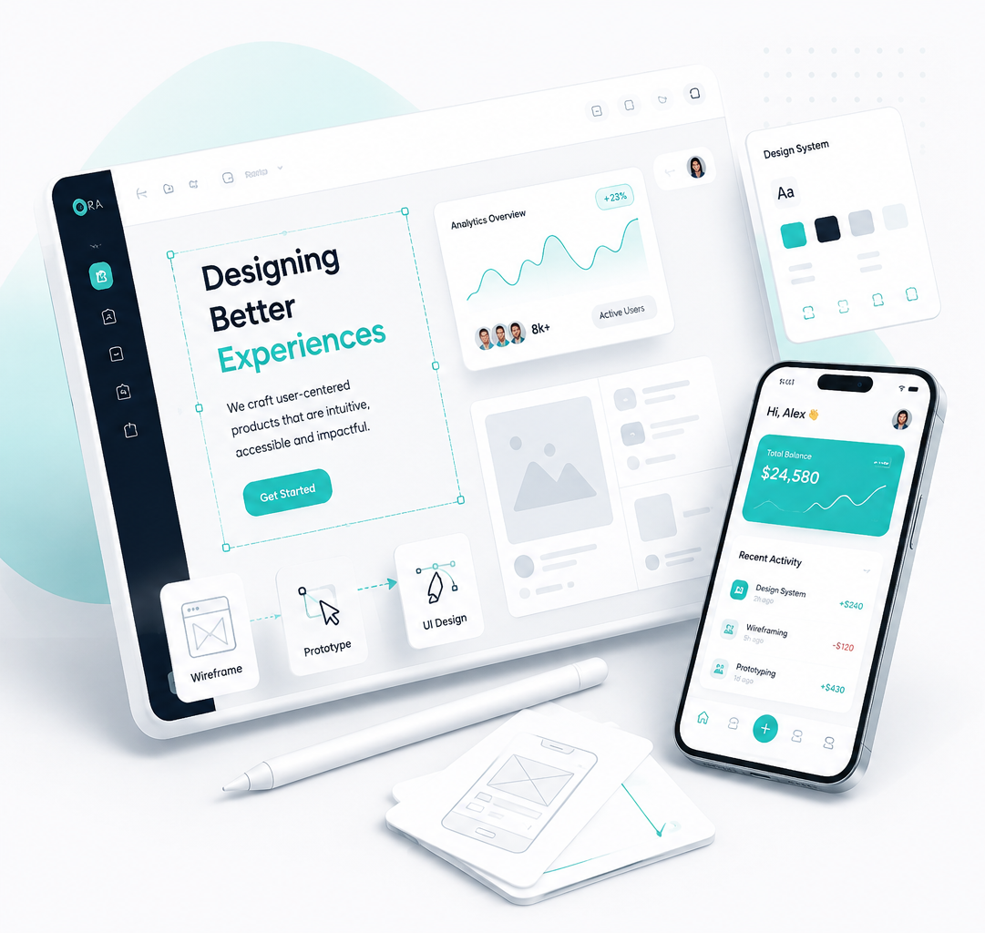
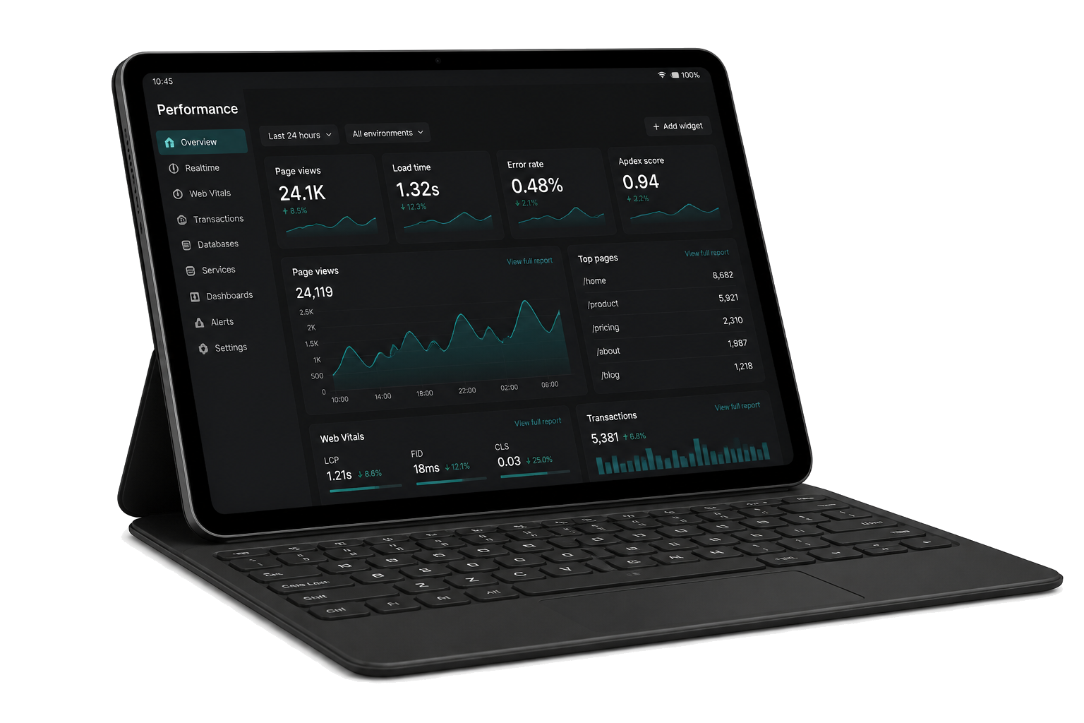
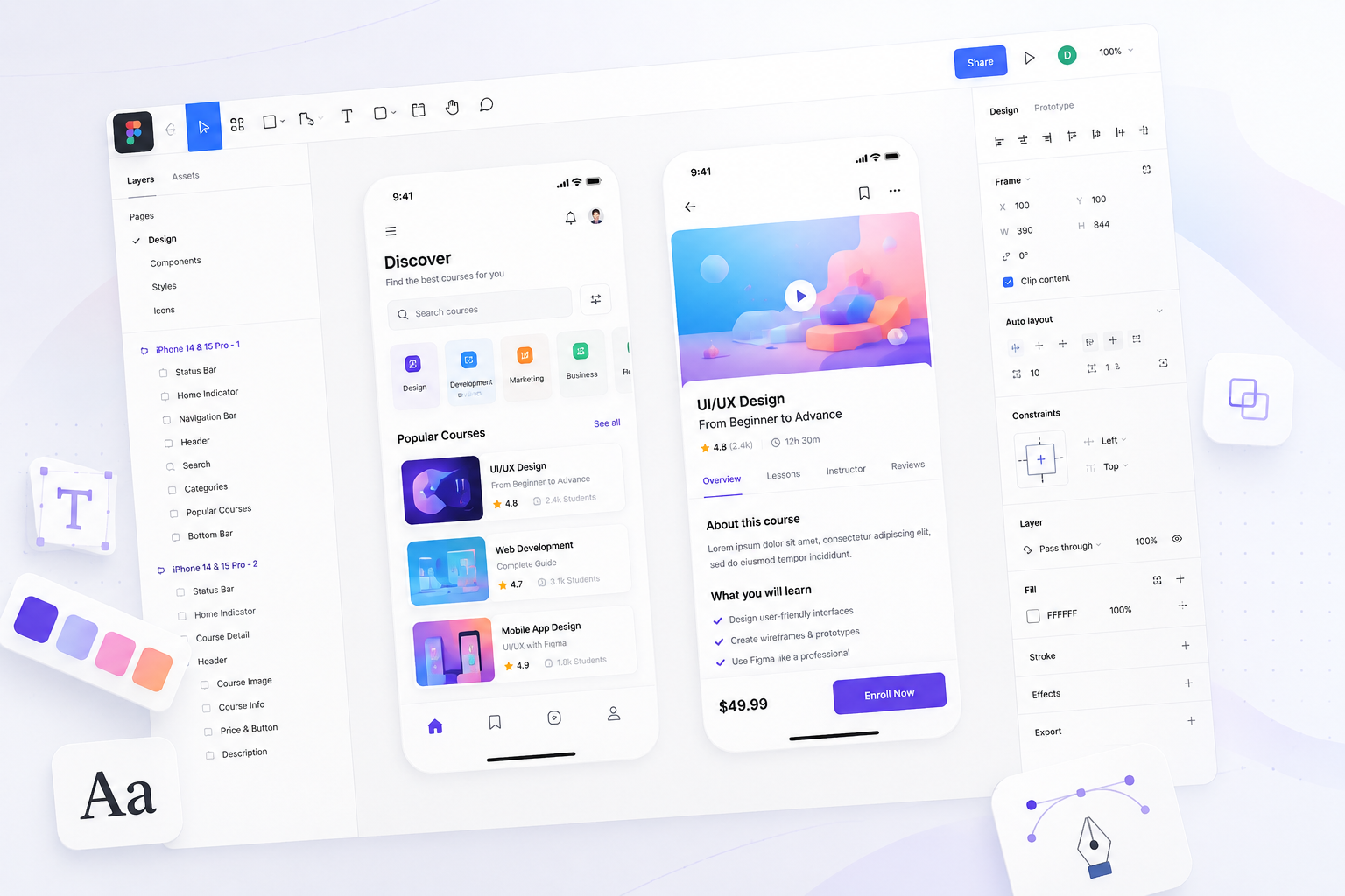
Professional UI UX design workspace featuring mobile app interfaces, wireframes, color palettes and design tools
Core Definition

What UI/UX Design Truly Means

UI/UX Design is the harmonic fusion of visual craftsmanship and behavioral strategy. UI (User Interface) defines the visual touchpoints typography, color palettes, spacing grids, and component aesthetics. UX (User Experience) defines the structural journey cognitive logic, user flows, friction reduction, and intuitive problem solving.

Together, UI and UX turn software applications from complex digital utilities into intuitive, delightful experiences that users adopt effortlessly and advocate for.

Sensory UI Touchpoints

Stunning aesthetics, brand identity, and polished micro animations.

Strategic UX Flows

Frictionless task completion, cognitive ease, and user retention.

ora-saas-dashboard.com/analytics
Live Spec
ORA
Conversion Rate+4.8%
Weekly Revenue$12,450
1
Ergonomic NavigationLogical hierarchy designed around user-flow muscle memory.
2
Micro-interactionsVibrant visual feedback builds user engagement and clarity.
3
WCAG 2.1 Compliant contrastButton elements pass strict AA contrast specifications (14.2:1 ratios).
πŸ’‘ Hover over indicators (1, 2, 3) to inspect the cognitive engineering details.
Side by Side Matrix

UI vs UX: How They Complement Each Other

UX is the skeletal blueprint and strategic foundation; UI is the visual skin, polished aesthetic, and sensory interaction.

UI Design

User Interface (Sensory & Visual)

  • Visual Aesthetics, Colors & Typography Scales
  • Button States, Micro animations & Motion Effects
  • Component Uniformity & Design Token Libraries
  • Pixel-perfect Responsiveness & Layout Grids
  • Brand Expression & High-Fidelity Presentation
  • Design Token Export (CSS Variables / JSON)

UX Design

User Experience (Strategic & Structural)

  • User Research, Interviews & Empathy Canvas
  • Information Architecture & Navigation Trees
  • Interactive Wireframes & Task Flow Diagrams
  • Usability Testing, Heatmaps & Drop off Analysis
  • Friction Reduction & Behavioral Ergonomics
  • Cognitive Load Optimization & Time to Value
Battle-Tested Workflow

Our 6 Step End to End Design Process

A structured, human-centered workflow designed to eliminate risk and deliver predictable product excellence.

Step 1

Discovery & Strategy

Understanding business goals, target audience demographics, competitor landscapes, and project scope. We run collaborative alignment sessions to map constraints.

Tool:FigJam / Miro
Deliverable:Stakeholder Alignment & Strategy Board
figjam_strategy_board.jam
Active Sprint

User Goal: Branding.

UX Research

Target Metric: Current Trend%.

Product Strategy

Friction Points: User cycology.

Stakeholder Audit

Solution: Client Requirement.

Tech constraint
Tool: FigJam / MiroDeliverable: Strategy Blueprint

πŸ”§ Tool: FigJam / Miro β€’ Deliverable: Stakeholder Alignment & Strategy Board

Step 2

User Research & Personas

Conducting user interviews, empathy mapping, survey data analysis, and behavioral persona creation. We design detailed character paths based on quantitative feedback.

Tool:Figma / Interview Logs
Deliverable:Interactive User Persona & Empathy Card
Deliverable: Persona.pdf
SJ

Sarah Jenkins, 34

Marketing Director β€’ Tech-Savvy

"I buy luxury wines online during busy workdays. If the check-out asks for redundant address forms twice, I abandon the order instantly."

Pain Points
  • Mandatory account setup
  • Inflexible payment options
Core Motivations
  • 1-tap payment solutions
  • Fast delivery confirmation
Tool: User Interviews / FigmaDeliverable: Verified Empathy Map

πŸ”§ Tool: Figma / Interview Logs β€’ Deliverable: Interactive User Persona & Empathy Card

Step 3

Information Architecture

Creating structured sitemaps, navigation trees, content hierarchy, and friction-free user task flows. We map pathways to verify cognitive clarity early.

Tool:Figma IA / Octopus.do
Deliverable:Navigation Sitemap & Journey Map Tree
user_flow_structure.xml
Optimized Path
Homepage (Product Discovery)
100% Entry
PDP (Product Detail & Add to Cart)
60% Dropoff Alert
Redesigned 1-Click Checkout
Checkout Optim.
Risk Reversal: Added inline trust badges and payment options (Klarna, GPay, Apple Pay) in one sheet.
Tool: Figma IA / Octopus.doDeliverable: Sitemap & Flow Chart

πŸ”§ Tool: Figma IA / Octopus.do β€’ Deliverable: Navigation Sitemap & Journey Map Tree

Step 4

Wireframing & UX Flow

Building low-fidelity wireframes to validate layout structural ergonomics before visual styling. We trace screen components without visual styling distractions.

Tool:Figma Low Fi drafts
Deliverable:Grayscale Layout Wireframes & Skeletons
[draft_checkout_wireframe_v3]
Grayscale Layout
❌[Image Box]
[Primary Call To Action]
Form fields grouped for cognitive ease
Tool: Figma WireframesDeliverable: Low Fi Wireframe Flows

πŸ”§ Tool: Figma Low Fi drafts β€’ Deliverable: Grayscale Layout Wireframes & Skeletons

Step 5

Visual UI & Motion

Crafting high-fidelity UI screens, color tokens, typography scales, glassmorphism, and micro interactions. Witness the visual leap using the slider widget.

Tool:Figma UI Library
Deliverable:Interactive Wireframe β†’ High Fi UI Screen
transformation_comparison.svgSlide left-right to preview
❌ [Promo Visual]
OORA Checkout
Premium Selection
Vagabond Red SelectionΒ£24.99

πŸš€ Free next day UK shipping included.

πŸ›‘οΈ Secure checkouts verified by McAfee.

↔️
Tool: Figma UI AssetsDeliverable: High Fi UI Screen Transformation

πŸ”§ Tool: Figma UI Library β€’ Deliverable: Interactive Wireframe β†’ High Fi UI Screen

Step 6

Prototype & Handoff

Delivering clickable Figma prototypes and inspect ready design tokens for engineering teams. Our files include redline details and component structures.

Tool:Figma Dev Mode
Deliverable:Dev ready Figma Specs & Component Token Sheet
D
Figma Dev Mode Inspect Selected
Ready for DevCode: CSS
Selection: Button
Primary Checkout
12
12
6
6
margin-bottom: 24px (redline)
Layout Spec
display: flex;
padding: 6px 12px;
border-radius: 8px;
Design Tokens
background: var(--color-teal-500);
font-family: var(--font-primary);
font-weight: 700;
Tool: Figma Dev ModeLaunch Interactive Proto

πŸ”§ Tool: Figma Dev Mode β€’ Deliverable: Dev ready Figma Specs & Component Token Sheet

Process Transparency

Inside Our Design Workflow

We don't hide behind sales pitches. Here is a live glimpse of the actual internal files, sprint trackers, and testing assets we use daily to coordinate client success.

πŸƒβ€β™‚οΈProject Velocity
Sprint 24 (Active)Velocity: 94%
🎟️ UI-21: Redesign Checkout PageIn Review
🎟️ UI-22: Spacing Redlines SpecTesting

Linear Sprint Board

Live backlog and sprint tickets trackable by the client in real time.

πŸ”€Design System
variables.css
--font-heading: 'Outfit', sans-serif;
--font-size-hero: clamp(2.5rem, 6vw, 4.5rem);
--spacing-grid-base: 8px;
--spacing-layout-lg: 64px;

Figma Typography Tokens

Centralized spacing scale, styles, and typography values configured globally.

πŸ”₯Usability Testing
Buy Now
CTA click heatmap concentration

Session Heatmap Cluster

Quantitative click and attention analytics showing visual engagement.

πŸ“Design Quality
ORA Pixel Perfect Grid Alignment Specs

Pixel-Perfect Layout Grid

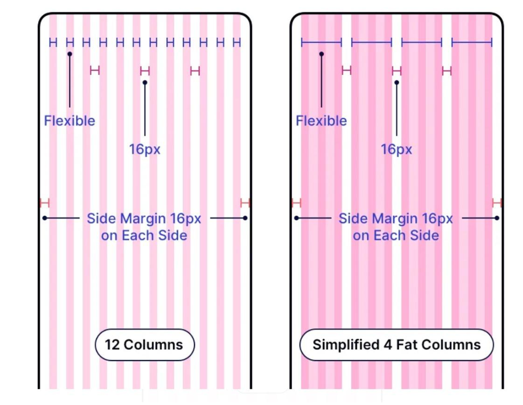
We align components to a strict 12-column mobile grid and simplified 4-fat-column layout. Spacings and flexible boundaries are locked down to 16px margins on each side to guarantee layout precision across all screen sizes.

Expert Team

Who You'll Work With

Direct accessibility to senior creators. No sales middle men you collaborate directly with the dedicated product specialists building your success.

MV

Marcus Vance

Design Director & Lead Architect

Ex-Figma Senior Designer, 10+ years experience building SaaS UI layouts and responsive design frameworks.

Core Domain:SaaS Layout Architecture & Design Systems
CC

Clara Chen

Senior UX Researcher

Specialist in cognitive psychology and usability lab testing. Conducted over 400+ user interviews.

Core Domain:User Persona Audit & Conversions
DK

David K.

UI Engineer & Handoff Lead

Expert in translating Figma styles directly into clean, responsive Next.js/Tailwind components.

Core Domain:Figma Handoff & Frontend Engineering
Research & Ergonomics

Empathy Driven Research & Wireframing

We never design on assumptions. We gather qualitative insights through user interviews, empathy maps, and competitor teardowns to build structural wireframes that validate functional ergonomics before visual polish.

User PersonasMapping demographic profiles & core motivations
Empathy CanvasAnalyzing user thoughts, feelings, and pain points
Sitemap HierarchyOrganizing navigation for 1 click task completion
Low Fi WireframesValidating content placement & ergonomics
Sitemap & Architecture Tree
/ (Application Root)
β”œβ”€β”€ /dashboard (Analytics Wireframe)
β”œβ”€β”€ /checkout (Frictionless 1 Click Pay)
└── /settings (Permission Tree)
Aesthetics & Motion

Visual UI Design & Interactive Prototyping

We apply modern typography scales, glassmorphic depth layers, and grid systems alongside clickable interactive prototypes. Test interactive states live below:

Scalability & Inclusion

Scalable Design Systems & WCAG Accessibility

We build atomic design systems (Atoms β†’ Molecules β†’ Organisms) and design token variables alongside strict WCAG 2.1 AA/AAA accessibility compliance.

WCAG 2.1 AAA Contrast Checker

#07162D Dark Navy on #FFFFFF14.2:1 AAA PASS
Portfolio Showcase

Featured UI/UX Projects

Explore recent digital product transformations engineered by ORA.

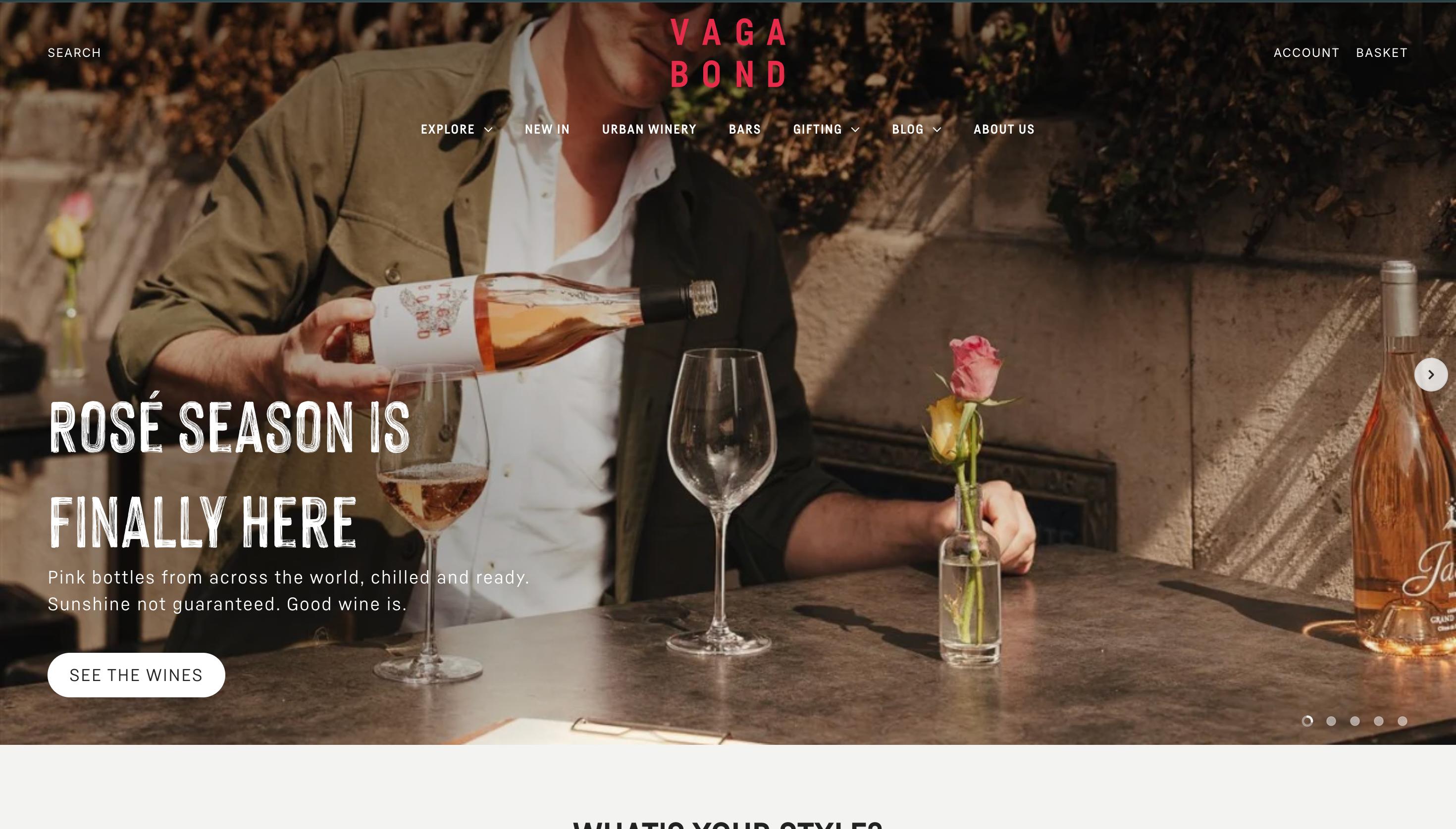
Vagabond Wines UK
Shopify β€’ Web UI/UX

Vagabond Wines UK

Custom Shopify experience with interactive wine discovery, subscription engine, and seamless wine bar tasting integration.

+45% Online Sales β€’ 3.2x Engagement

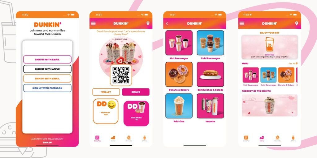
Dunkin' Donuts Lebanon
iOS & Android App

Dunkin' Donuts Lebanon

High performance mobile ordering app with live loyalty rewards, store finder, and lightning fast checkout flow.

500K+ Active Users β€’ 4.9 Star Rating

Tooth Tycoon EdTech
EdTech β€’ Mobile UX

Tooth Tycoon EdTech

Interactive financial literacy app for kids with gamified rewards, parent controls, and engaging micro animations.

88% Course Completion β€’ 60% Higher Retention

Strategic Advantage

Why Choose ORA for UI/UX Design

Human-Centered Design

Putting user needs and behavioral ease at the core of every interface.

Business-Driven Strategy

Aligning product design directly with growth, conversion, and retention goals.

Pixel-Perfect Execution

Crafting ultra-clean, polished designs with rigorous attention to detail.

Dedicated Design Squad

Direct collaboration with senior UI/UX directors and product strategists.

Fast Turnaround Times

Agile 1 week sprint delivery cycles that keep product launches on schedule.

100% Client Ownership

Full ownership of all Figma source files, prototypes, and asset libraries.

Trusted by Industry Leaders Worldwide

SHOPIFYDUNKIN DONUTSVAGABOND WINESGOOGLE CLOUDNHSKLARNA
Client Feedback

What Clients Say About Our UI/UX Design

IdeoBooks Product Team

IdeoBooks Product Team

Company Logo

Bookkeeping Platform β€’ Glasgow, UK

β˜…β˜…β˜…β˜…β˜…

β€œWe went into this knowing bookkeeping software usually ends up either too basic or way too complicated. ORA actually got that balance right. They spent real time...”
Tooth Tycoon Founder

Tooth Tycoon Founder

Company Logo

EdTech Startup β€’ South Africa

β˜…β˜…β˜…β˜…β˜…β˜…

β€œI came to ORA with basically a napkin sketch and a strong opinion about how kids learn money habits. They ran with it. What I didn't expect was how much they pushed...”
Digital Operations Team

Digital Operations Team

Company Logo

Dunkin' Donuts β€’ Lebanon

β˜…β˜…β˜…β˜…β˜…β˜…

β€œOrdering apps break under real traffic all the time, so that was our biggest worry going in. ORA built the backend to handle our loyalty program and order volume...”

Got Questions?

Frequently Asked Questions

Everything you need to know about our UI/UX design services, deliverables, and process.

Timelines depend on project complexity and scope. A standard mobile app or Web SaaS platform UI/UX design takes between 4 to 8 weeks. This includes upfront user research, wireframing, high-fidelity UI design, interactive prototyping, and final design system token export.

Let's Build Something Great

Ready to transform your product's UI/UX?

Get a free project estimate and UI/UX consultation from our product design directors. Tell us about your vision and let's craft an experience users love.

Free 30-Minute UI/UX Strategy Consultation
Comprehensive Design Audit & Blueprint
Guaranteed 100% WCAG 2.1 Accessibility
Full Figma Source File Ownership
πŸ›‘οΈ ORA Risk Reversal Guarantee

No upfront commitment required: We deliver your first interactive homepage or dashboard design concept before you sign any contract or payment. If you don't love the visual direction, you walk away with zero obligations. You also receive 100% full intellectual property & Figma file ownership.

Request Free Design Audit

Fill in your details to schedule a call with our senior UI/UX team.